Diners Club International
Brand Identity redesign for Diners Club International
BRANDING
Rebranding/Identity, Print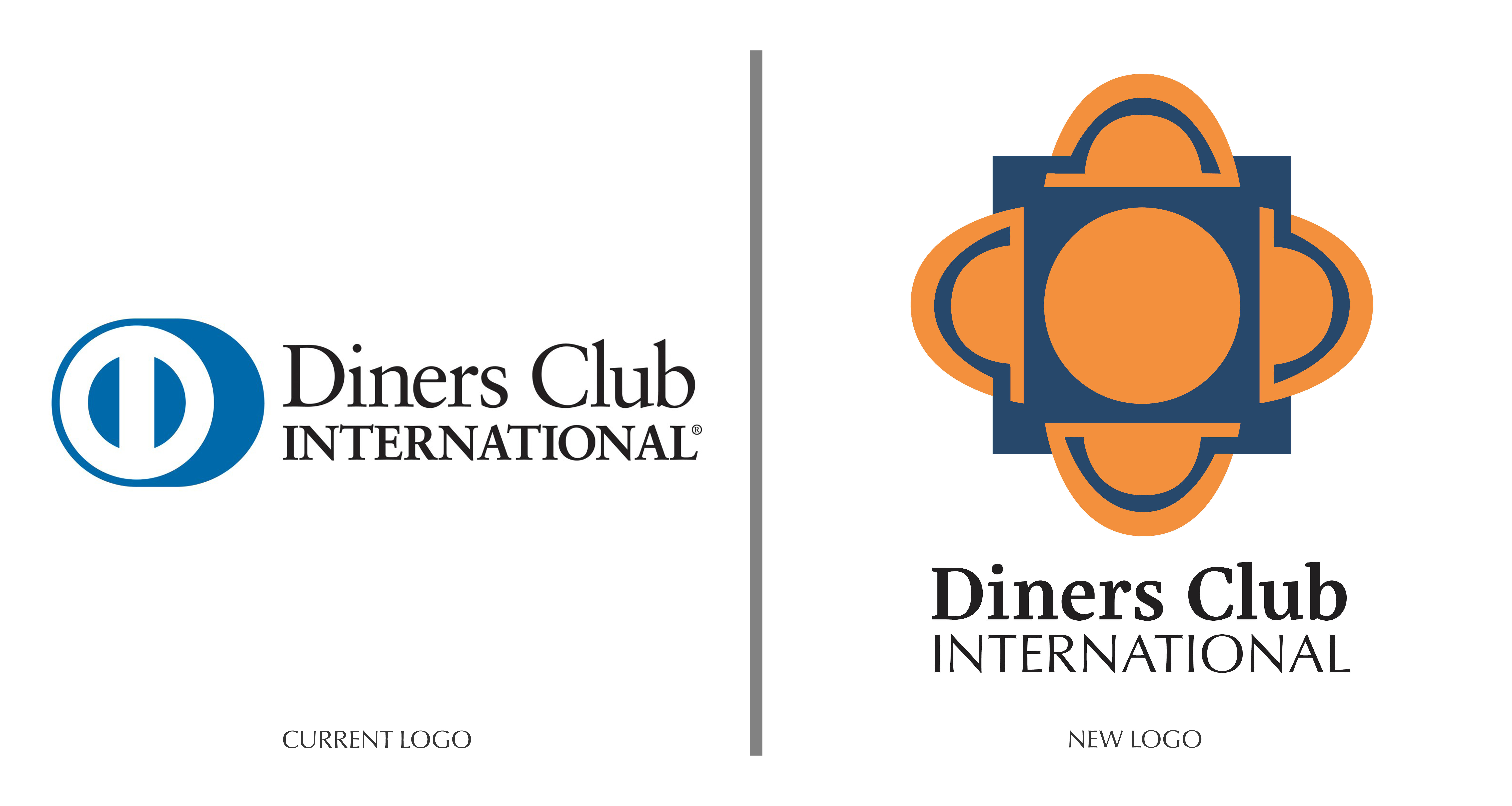
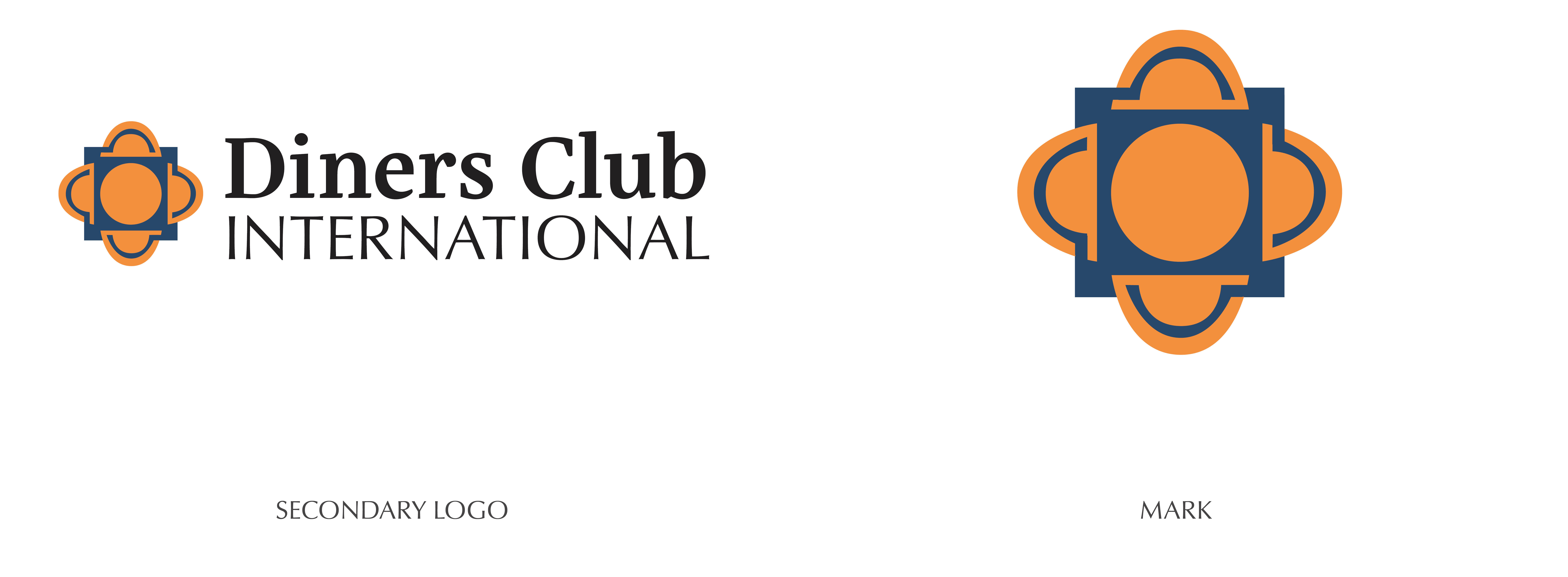


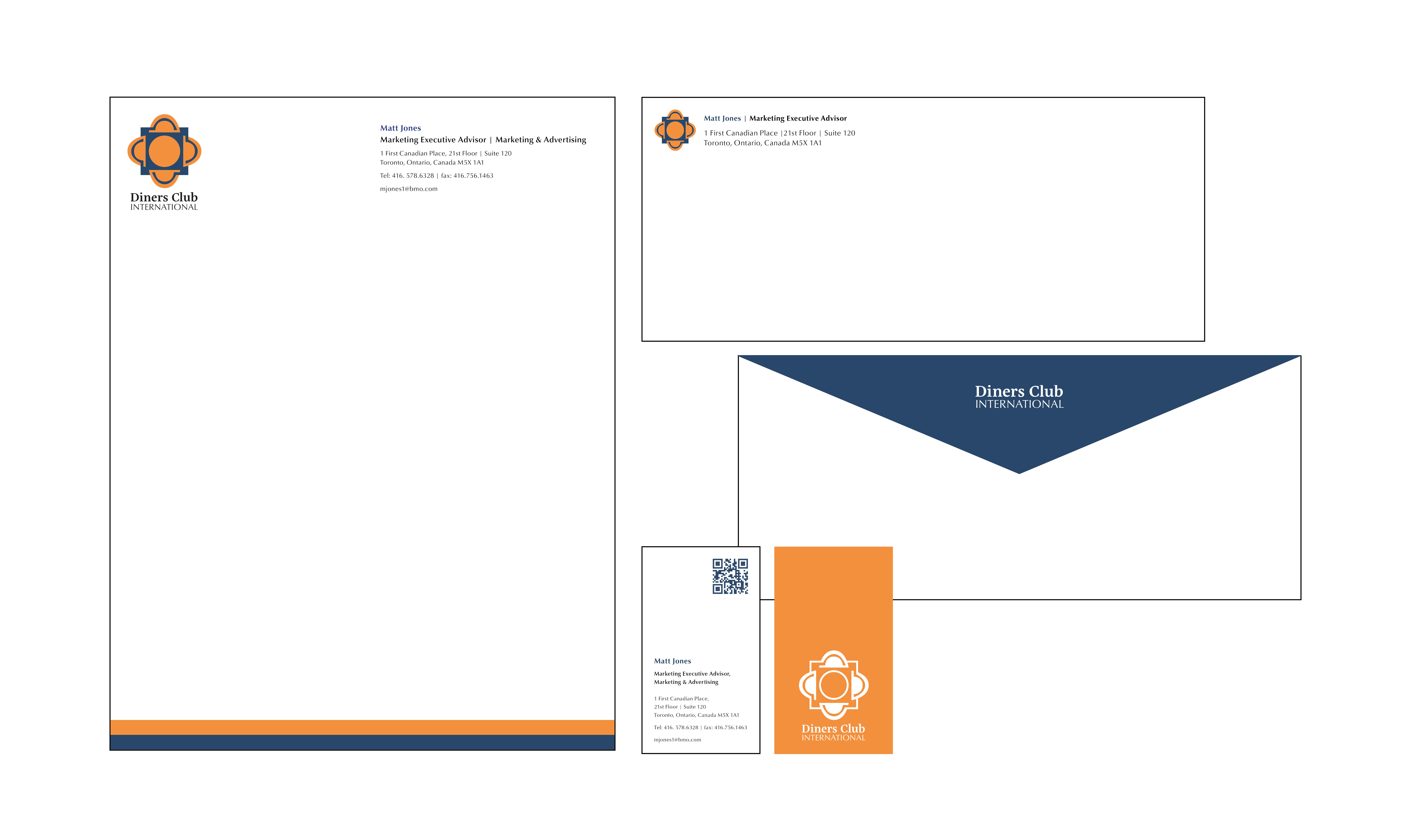

The brand identity redesign for diner’s Club International was based on updating the brand to fit the original concept but also to engage a new younger audience that would be interested. Since Diners Club International is a membership card that focuses mainly on leisure, travel, and restaurants It was imperative that the color choices, typography and graphics reflected that.
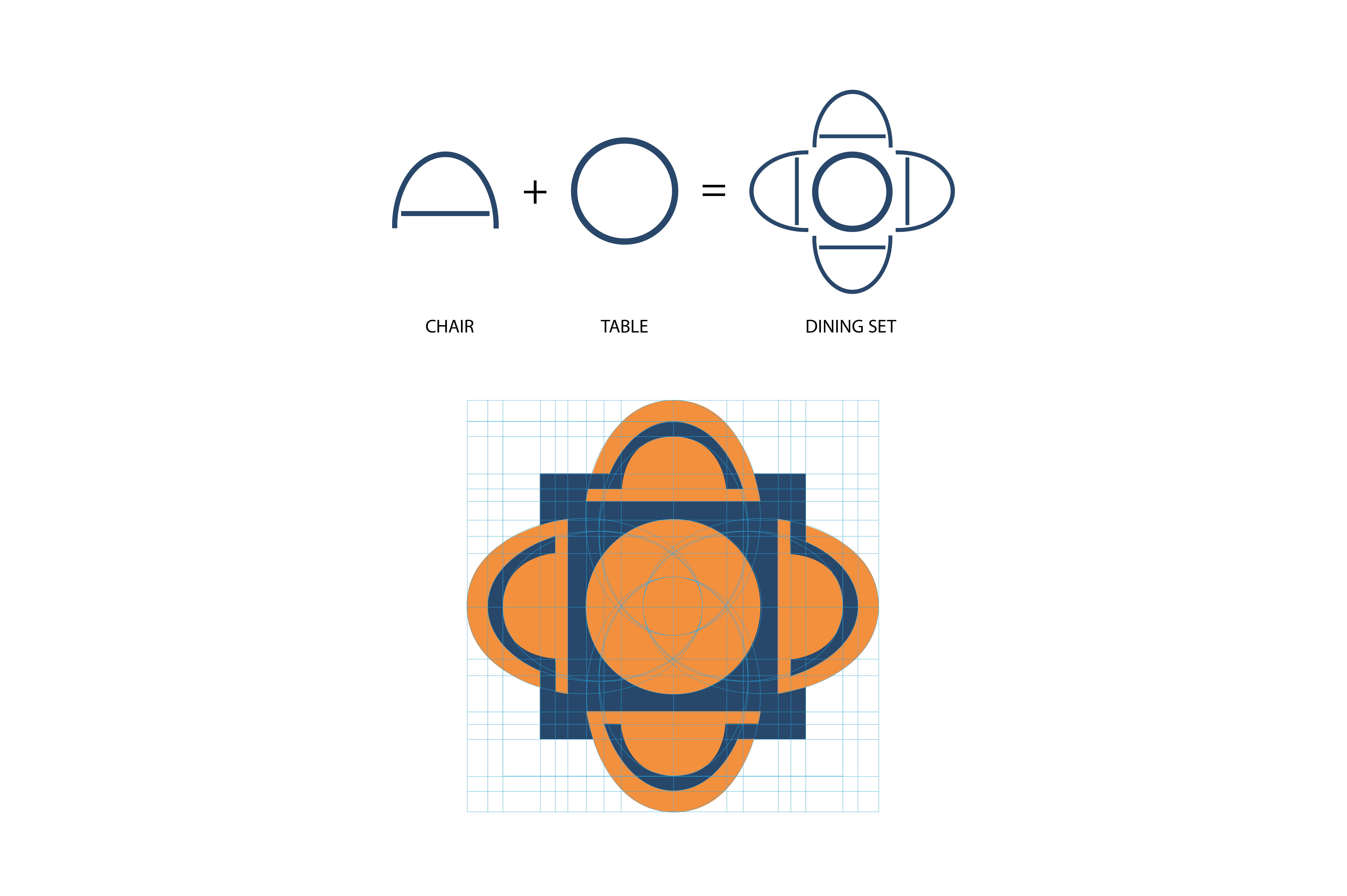
The logo itself is a combination of elements that is used to mimic and represent a top view of a tablescape set for four that mimics the idea of conversation, sitting down, and intimacy.
